Commercial Furniture Group
The Psychology of Color and Design
Carl Jung was one of the most esteemed behaviorists of the 20th century. He is thought to have popularized many of the core beliefs about color and once said, "Colors are the mother tongue of the subconscious." To this day, color has major implications across our world. Whether it is food, advertising, automobiles, lighting or furniture, color selection matters. Aside from having a preference for blue or green, interior designers use concepts from color psychology to create the right environment or feel for a space. There is little doubt that color impacts emotion or moods. The dominant color of a space can effects perceptions of the space or even the business. Cultural backgrounds, gender and geography can even cause one person to react differently to color than another. Below are some tips to consider when choosing interior finishes.Pink
Pink is trending right now! But where should this bold, eye-catching color be applied, especially in design? Many people associate pink with softness, love, calmness, and optimism. Adding accents of pink chairs or booths to any space would bring in a more playful, youthful feel. With there being so many shades of pink, the color can be used to create a bold statement or soft and subtle accents. However, pink is an intense color that can be easily overdone, so being careful not to overapply is best.Yellow
Yellow is bright and bold and, like pink, should be used in moderation. Splashes of yellow throughout upholstery patterns or an accent wall can make guests feel cheerful, optimistic, and creative. However, too much yellow within a space can also lead to feeling overwhelmed and potentially stressed. One benefit of yellow is that it can help guests with decision-making. Like most things, moderation is key and yellow is a fun color to design with.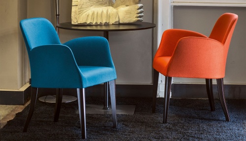
Blue
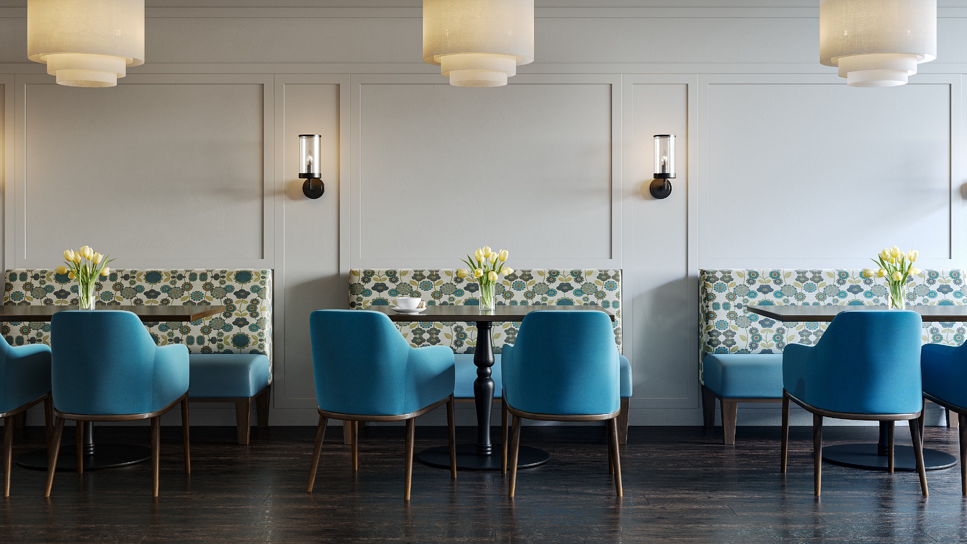
Blue has many layers and meanings due to the diverse history and wide variety of shades. Blue promotes feelings of trust and dependability, which are incredibly positive and powerful emotions. Incorporating blue throughout spaces such as offices and hotels can generate feelings of trust and relaxation for your guests. With many shades ranging from soft pastels to vibrant neon’s, the possibilities with blue are endless.Red
Red is everywhere! From food to branding, red is a very popular primary color. But how does it make people feel in space? People often associate feelings of love, passion, confidence, appetite, and energy with red. It is important to remember that it is a very dominant color, so like yellow, moderation is key. Adding red chairs or booths in dining spaces can increase appetite and is an excellent way to accent certain design features. One way to do this is to add red on interesting wall or ceiling accents, red throw pillows, or even red table bases! Another way to do this is by incorporating a mixture of red furniture with more neutral colors, giving your guests visual interest when entering a space.Green
It’s obvious the color green is abundant in natural settings. Because of this, green is often associated with feelings of peace, recovery, and security, which are all beneficial to the emotional health of individuals. Green comes in a range of shades and can be the primary color of a space without being overwhelming, unlike many other colors. Due to its association with feelings of recovery, it can be utilized in healthcare facilities to evoke positive emotions and a sense of good health. Additionally, designing green oriented lounges or lobbies can relax your guests and provide them with a sense of peace and safety.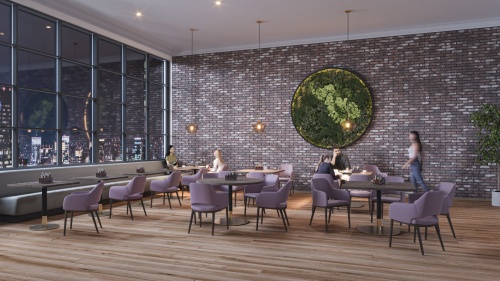
Purple
Purple is a unique color with many associations. This rich color represents royalty, mystery, creativity, courage, and is known to be anxiety relieving. This versatile color can be a great design tool that can be used in a multitude of spaces. Purple can be implemented heavily without overstimulating guests. Use a purple velvet upholstery and soft patterned wallcovering to elevate the feel of luxury in your designs.Orange
Like yellow, orange is a vibrant and lively color that evokes energy. Additionally, orange has a strong association with the autumn season, so it is no surprise people often associate orange with harvests, warmth and in some cultures, spirituality or unity. Incorporating orange in your color schemes can be an enjoyable challenge. There’s a fine line of just enough and too much orange that could result in an overwhelming atmosphere. With softer, less vibrant shades, orange can be sprinkled elegantly and generate a beautiful, warm and welcoming space.Color is an incredibly powerful tool, especially in design. It can serve multiple purposes, from highlighting specific aspects of a design to setting an overall mood. It can even conceal or divert attention from imperfections. When used thoughtfully and intentionally, color can transform a space in remarkable ways. Understanding the psychology behind each color can make it easier to leverage this tool effectively. By understanding how different colors evoke various emotions and perceptions, designers can strategically use color to enhance a space according to its purpose, whether it's to create a calming environment, stimulate creativity, or draw attention to key elements. This knowledge allows for a more impactful application of color, making it an important component in achieving successful designs.
What is your favorite color? According to Emotional Reactions to Color by Kathy Lamancusa the US population prefers blue 35% of the time and green 16% of the time. These choices are followed by purple 10% and red 9%. As you can see, color matters!